
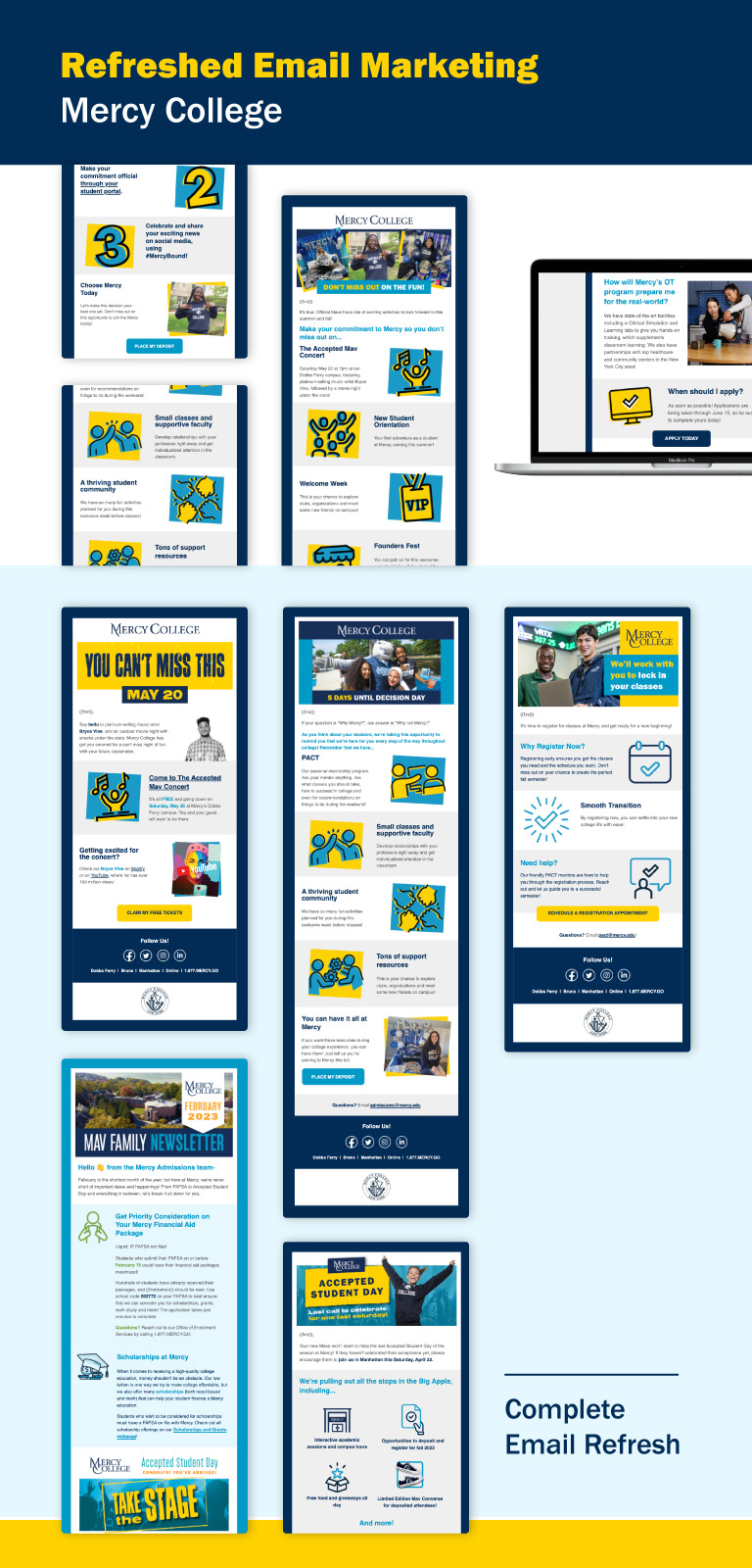
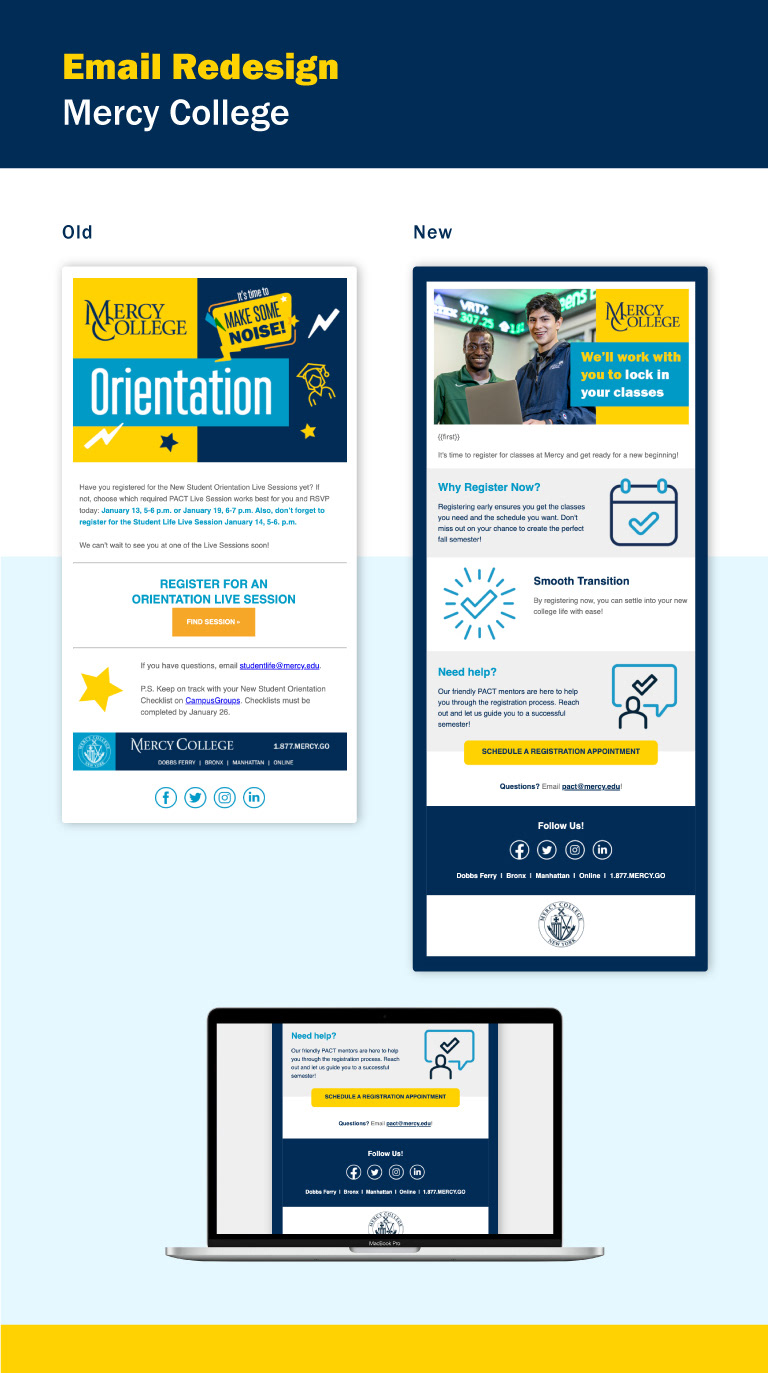
In a side by side comparison, we have a "specialized" email, next to a "regular" email. The first upgrade was the use of the Mercy navy color incorporated into the background of all emails. To make emails flow better, there is more imagery used for different paragraphs instead of just reading blocks of text. Additionally, buttons have been given a more aesthetic look. Finally, the footer has been designed to be completely digital. The previous design had the footer as merely an image. The redesign has pure text and separate icons for each social media account and creating a cohesive look overall.